
GetInsights Blogs
Getting real answers out of your data
Guides on business intelligence, dashboards, and analytics — written for the people who need the answer, not the people who write the SQL.

Agentic Analytics: How AI Answers Data Questions and Acts Safely
A dashboard can show that conversion fell. It cannot always investigate the cause, test competing explanations, and tell the right team what to do next. Agentic analytics is designed to close that gap: an AI system interprets a business goal, plans and runs multiple analytical steps, checks the evidence, and recommends or triggers an appropriate next action.
Read articleMore articles

Architecture of Data Warehousing: Layers, Tiers, and Design
When reports disagree, dashboards lag, or every new metric needs another fragile pipeline, the problem is often deeper than the BI tool. The architecture of data warehousing determines how data moves, where it is cleaned, who can trust it, and how quickly it becomes useful.
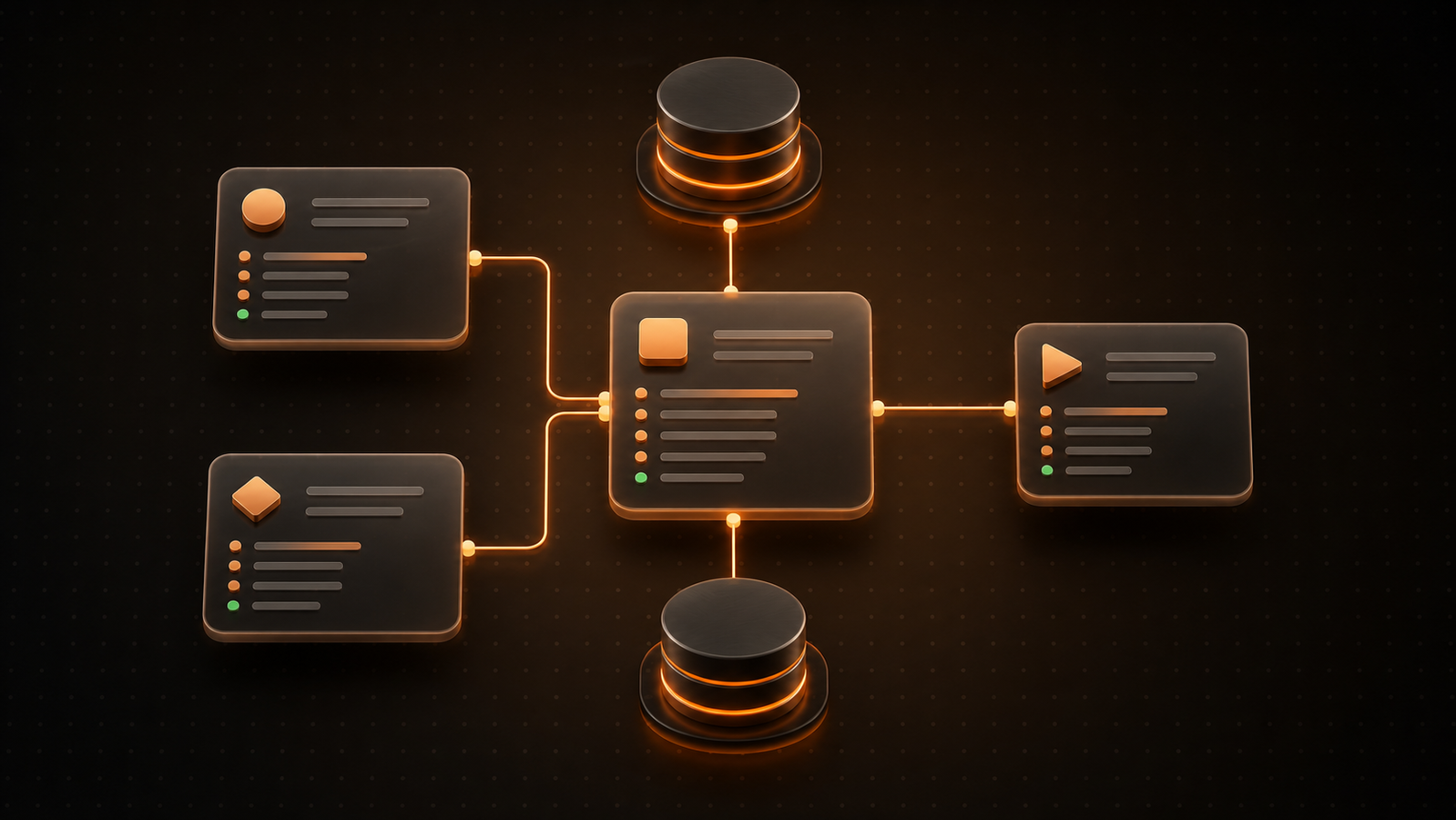
What Is a Conceptual Data Model? Examples and 7 Steps
When teams jump straight from a business request to tables and columns, they often build a technically valid database that answers the wrong questions. A conceptual data model prevents that mismatch by defining the business concepts, relationships, and rules everyone must agree on before implementation begins.

AI Governance Best Practices: A Practical Enterprise Guide
AI governance should make responsible delivery repeatable, not slow every experiment. Use this practical guide to build risk tiers, lifecycle controls, evidence, metrics, and a focused 90-day rollout.

Business Intelligence for Manufacturing: A Practical Guide
Manufacturing BI should do more than display plant KPIs. This practical guide maps production questions to data, metrics, actions, security controls, and a focused 90-day pilot.

Tableau Competitors: 8 Alternatives Compared by Team Fit
Replacing Tableau is rarely a simple software swap. A lower license price can be erased by rebuilding calculations, retraining dashboard authors, or adding infrastructure that Tableau previously hid. The useful question is not “Which tool has the most charts?” but “Which architecture removes the constraint our team actually has?”
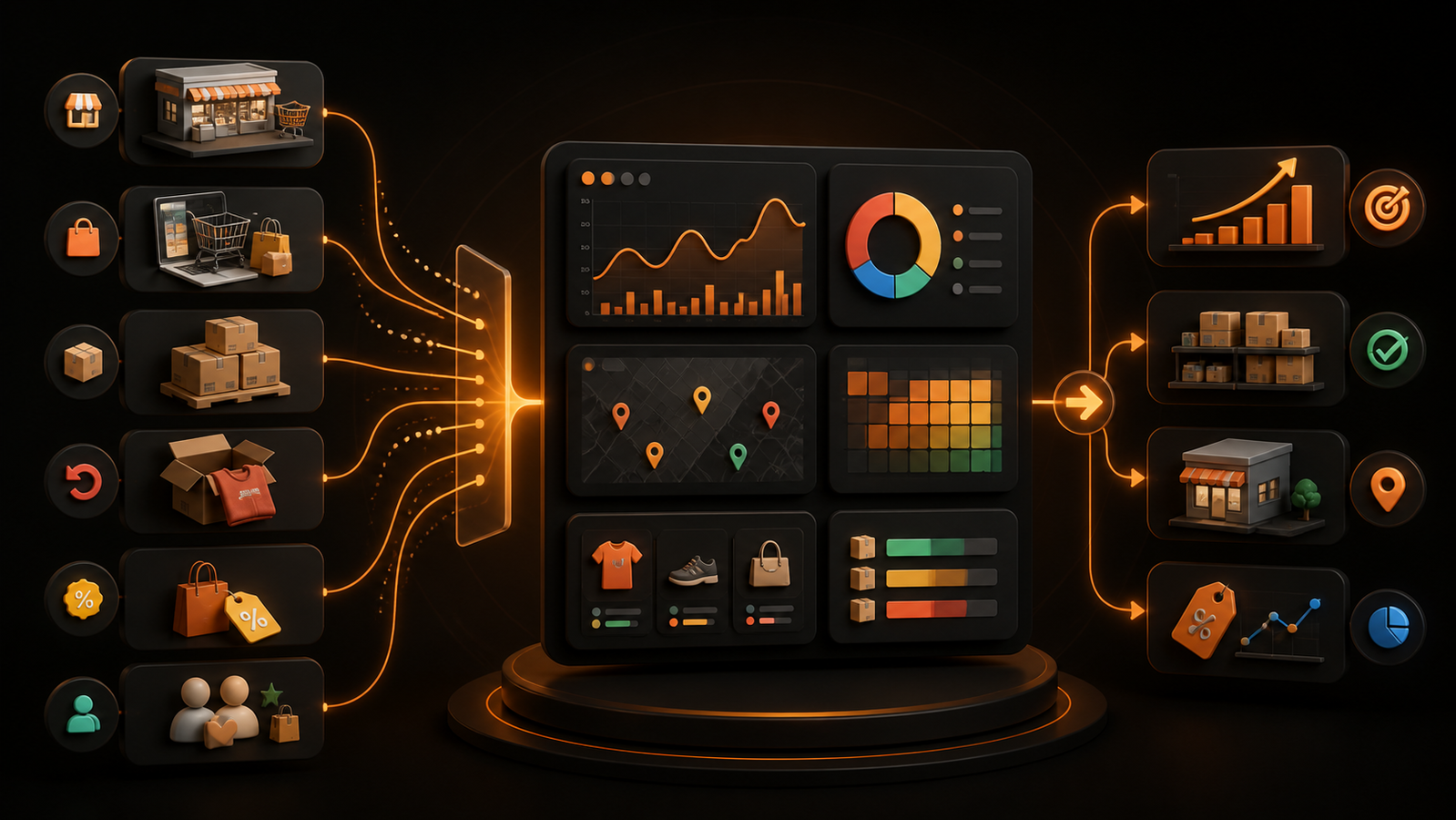
Retail Analytics Platform: 12 Features to Compare
A retail analytics platform should improve a real merchandising or operations decision—not merely add dashboards. Use this 12-feature checklist, pilot plan, and weighted scorecard to compare your options with evidence.

B I Strategy: A Practical 90-Day Business Intelligence Plan
A useful BI strategy starts with a decision, not a dashboard. Use this practical framework to define ownership, trust, adoption, and a measurable 90-day pilot.

Metabase Alternative: GetInsights vs. Metabase
Your team should not need an analyst ticket for every follow-up question. But replacing one BI tool with another only helps if the new workflow changes who can get an answer, how safely they can query live data, and who must operate the platform.

Snowflake Reporting: How to Build Faster, Safer Dashboards
Snowflake can make a chart, but reliable reporting takes more than a connector. Use this practical guide to choose an architecture, secure access, control compute, and launch dashboards people trust.

How to Build a Business Analytics Dashboard in Minutes
Your numbers exist, but the answer you need is split across database tables, spreadsheets, and yesterday’s reports. A useful business analytics dashboard closes that gap: it gives a specific audience the few metrics and comparisons needed to make a decision now.
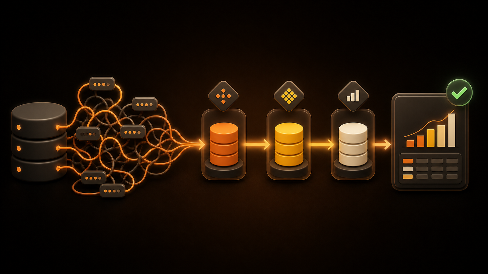
Postgres CTE: Syntax, Examples, and Performance
A report query starts as one join, gains an aggregate, then picks up three filters and a second aggregation. Before long, the nested SQL is technically valid but difficult to review. A Postgres CTE gives each logical step a name, so you can reason about the query as a sequence instead of decoding it from the inside out.

Bronze Silver Gold Data Layers: A Practical Medallion Architecture Guide
Bronze, silver, and gold should be more than three schema names. Use this practical guide to define what belongs in each layer, how data gets promoted, and when a simpler design is better.

SQL LIMIT Statement: Syntax, Examples, and Pagination
A query that returns every matching row can flood a console, slow a dashboard, or send far more data to an application than anyone needs. The SQL LIMIT statement solves the output problem by setting the maximum number of rows a SELECT query may return.
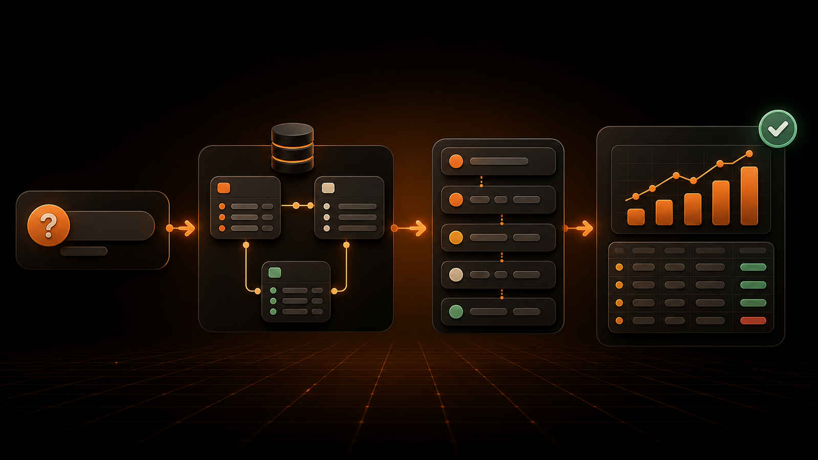
SQL Query Builder: Build Safe Queries Without Code
A SQL query builder can remove syntax work, but it cannot replace data context or verification. Use this practical workflow to build no-code queries, catch bad joins, enforce read-only access, and choose the right builder for your team.

Power BI Alternatives: 9 Tools Compared by Use Case
Power BI is not the wrong tool for everyone—but the right replacement depends on the constraint you need to remove. Compare nine alternatives by workflow, architecture, governance, cost, and migration effort.

Agent Bricks on Databricks: Full Breakdown, Comparison, and What to Evaluate Before You Build
Agent Bricks is not one product with one release date. Here is the component-by-component GA status, the real cost drivers, and how it compares to Genie and Mosaic AI.

SQL Beautifier: The Data Team's Guide to Tools, Integrations, and Production Workflows
Every result on page one is a paste-your-SQL box. None of them tell you which tool breaks on Postgres CTEs, or why pasting a production query into one is a governance decision.

Artificial Intelligence and Data Analytics: A Practical Guide for Business Leaders Who Don't Write SQL
Every guide on this topic explains what AI analytics is. None of them tell a founder what to do on Monday morning — which question to start with, what to ask a vendor, or how to run the numbers.
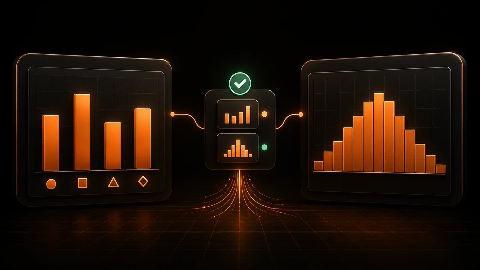
Bar Graph Versus Histogram: A Founder's Guide to Choosing the Right Chart
The two charts look almost identical and mean completely different things. Here is the one-sentence rule, the red flags, and a 60-second decision framework.