
Bar Graph Versus Histogram: A Founder's Guide to Choosing the Right Chart
The two charts look almost identical and mean completely different things. Here is the one-sentence rule, the red flags, and a 60-second decision framework.
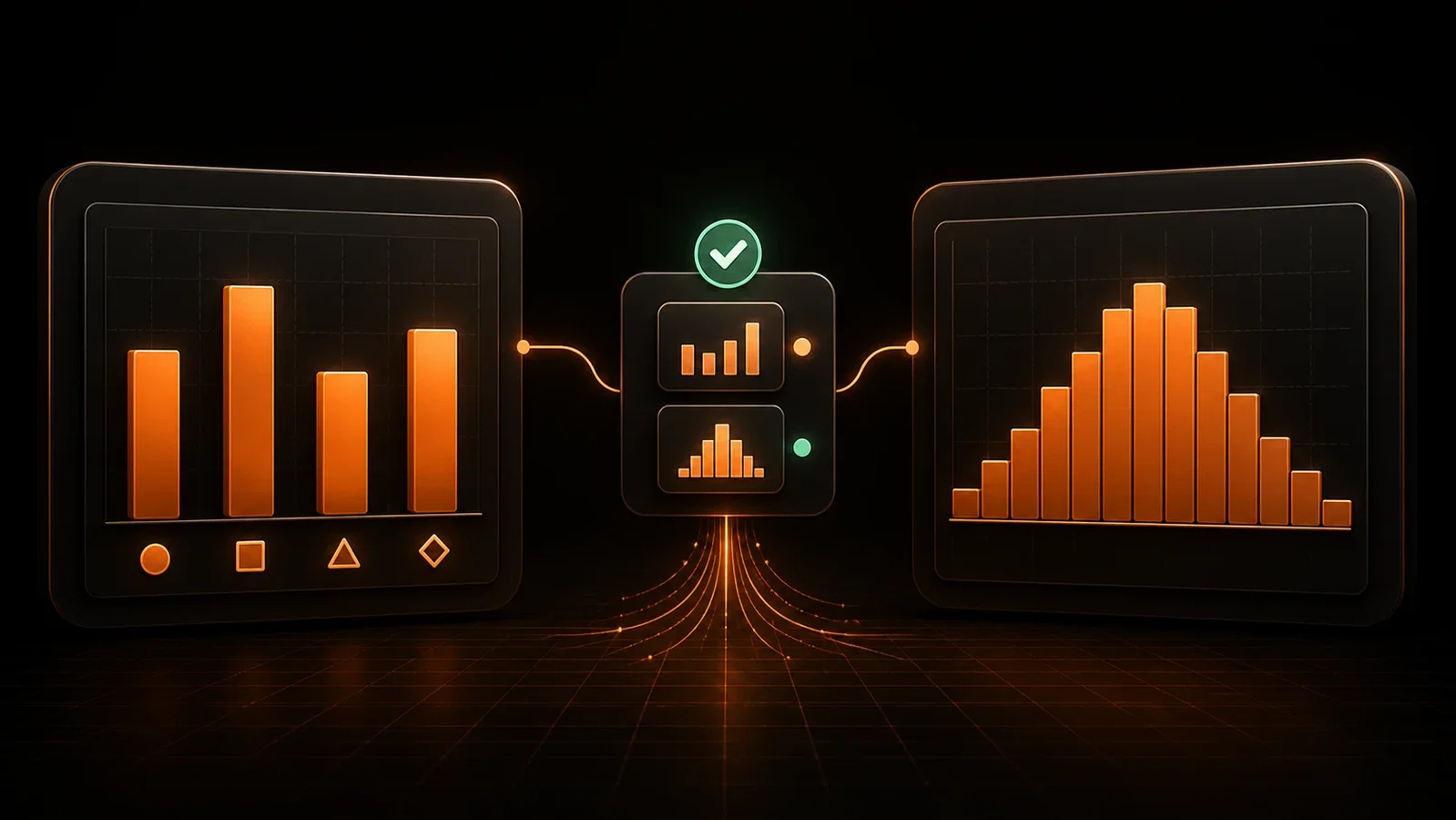
A founder walks into a board meeting with a chart showing customer purchase values. The bars look evenly spread across price points, so the team concludes pricing is healthy and moves on. The problem: they used a bar chart instead of a histogram, which meant the skewed distribution of purchases — most customers clustered at the low end, mid-tier almost untouched — was completely invisible. Two months later, churn spikes from exactly those underserved mid-tier customers.
Choosing the wrong chart in a bar graph versus histogram decision does not just look sloppy. It drives real business decisions in the wrong direction.
By the end of this article, you will have one sentence you can remember every time you build a chart, plus a checklist you can bookmark and share with your team.
The One-Sentence Rule That Separates Bar Graphs from Histograms
Bar graphs compare distinct categories. Histograms show how a continuous numerical variable is distributed.
That is the rule. Everything else is detail.
What a bar graph is actually showing
A bar graph plots values against named, separate categories — product lines, sales regions, customer segments. Each bar represents one group, and the height tells you its value. The categories have no mathematical relationship to each other; "Enterprise" and "Starter" are just labels, not points on a scale.
What a histogram is actually showing
A histogram plots how often values fall within a range — called a bin — along a continuous numerical scale. The X-axis runs from a low number to a high number, and each bar tells you how many data points landed in that range. According to Lucidchart, the practical rule experts use is that bar graphs show variance between distinct categories, while histograms show how numerical values are distributed across a continuous range. (Source: Lucidchart)
Why the gap between bars is the fastest visual cue
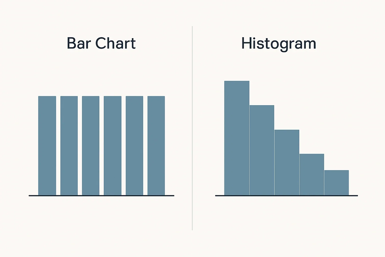
Look at the space between bars. In a bar graph, bars have gaps because the categories are genuinely separate — there is nothing between "Product A" and "Product B." In a histogram, bars touch, because the data is continuous — every value between $0 and $50,000 is possible, and there are no gaps in the underlying scale. If you see a histogram with gaps between its bars, that is a formatting error, not a style choice. It visually implies the data is categorical when it is not, which misleads anyone reading the chart.
Side-by-Side: Bar Graph vs Histogram on the Same Business Data
The same dataset can tell two completely different stories depending on which chart type you choose. Here is what that looks like in practice for a SaaS founder.
Scenario: plotting monthly revenue by product category
Your company has five pricing tiers: Free, Starter, Growth, Business, and Enterprise. You want to compare Q1 revenue across each tier to see where the money is coming from.
This is categorical data. Each tier is a named, separate group with no numerical relationship to the next. A bar graph is the right tool. You can immediately see that Enterprise and Business tiers dominate revenue, while Free and Starter contribute minimally. The bar diagram vs histogram choice here is straightforward: discrete labels, not number ranges, means bar graph every time.
Scenario: plotting the distribution of deal sizes closed last quarter
Now the same founder wants to understand the spread of the 200 deals closed last quarter. Deal sizes ranged from $500 to $48,000. The question is not "which category earned more?" — it is "where do most deals cluster, and how much variation is there?"
This is continuous numerical data. A histogram groups deal sizes into ranges — $0–$5,000, $5,001–$10,000, and so on — and shows how many deals fell in each range. That reveals the shape of your revenue: is it clustered at the low end, spread evenly, or bimodal with two distinct customer types? A bar graph on this same data would plot each individual deal size as its own bar and produce an unreadable mess, or it would plot totals per arbitrary label and hide the distribution entirely.
What each chart reveals — and what it hides
A bar graph on deal-size data hides the distribution. A histogram on product-category data makes no sense, because "Starter" and "Growth" cannot be sorted on a numerical scale.
A December 2025 experiment by Datylon demonstrated exactly this: the same dataset plotted as a bar chart looked uniform and unremarkable, while the same data rendered as a histogram clearly showed a right-skewed distribution. (Source: Datylon) The business analytics dashboards implication is direct — if you had acted on the bar chart, you would have concluded the data was evenly spread and allocated budget accordingly. The histogram would have shown you that most of your deals cluster under $10,000, which changes where you invest in sales resources entirely.
When NOT to Use a Histogram: Red Flags Founders Miss
Do not use a histogram when your data is categorical, when your sample size is too small to form meaningful bins, when you need to compare two separate groups side by side, or when your audience needs clear labels to follow the chart. Histograms are built for continuous numerical data at sufficient volume — outside those conditions, they create confusion rather than clarity.
Your data is categorical, not continuous
If you are comparing NPS scores across five customer segments — SMB, Mid-Market, Enterprise, Agency, and Developer — those are categories. There is no numerical spectrum running from SMB to Developer. Plotting this as a histogram in a bar graphs vs histograms decision would be meaningless. Use a bar graph. The same applies to any data where the X-axis would display names, labels, or types rather than numbers.
Your sample size is too small
Histograms need enough data points to populate bins meaningfully. If you have 15 deals, a histogram will produce bars of height one or two, and the "distribution" it shows is mostly noise. With small datasets, the shape of the histogram changes dramatically based on how many bins you choose, making it unreliable. A simple dot plot or a summary table communicates more honestly with limited data.
You need to compare two separate groups directly
Histograms show one distribution at a time clearly. Overlapping two histograms — for example, deal sizes from two different sales reps — becomes visually cluttered and hard to interpret. When direct group comparison is your goal, a grouped bar graph in a histogram vs bar diagram choice is cleaner and harder to misread.
You are presenting to non-technical stakeholders who need clear labels
A histogram requires the audience to understand that each bar represents a range, not a single value. In a board meeting or investor update, unlabeled bins like "$5,001–$10,000" slow comprehension. If your audience needs to grasp the point in under five seconds, a well-labeled bar graph will land faster.
If your X-axis labels are names, categories, or labels rather than number ranges, you need a bar graph, not a histogram.
Common Misconceptions Founders Have About Bar Graph Versus Histogram
These are not abstract errors. They are mistakes that show up in board decks, quarterly reviews, and business analytics dashboards every week.
Misconception 1: Gaps between bars are just a style choice
Gaps between bars carry meaning. In a bar graph, gaps signal that categories are separate and unrelated. In a histogram, bars must touch because the underlying data is continuous — every number in the range is a valid data point. Leaving gaps between histogram bars implies the data is categorical when it is not. (Source: Sparkl AP Statistics) A stakeholder seeing gapped bars on a histogram will read it as a bar diagram vs histogram hybrid and draw the wrong conclusions about whether segments are distinct or connected.
Misconception 2: More bins always means more insight
More bins do not mean more accuracy. Too few bins flatten the distribution and hide real patterns — a bimodal distribution with two customer clusters looks like one smooth hump. Too many bins create visual noise where every bar is height one or two, making it impossible to see any shape at all.
A practical starting rule: use the square root of your sample size as the number of bins for datasets under 1,000 rows. For 400 data points, that is 20 bins. Adjust from there based on whether the resulting chart shows a meaningful shape or just static.
Misconception 3: A histogram and a bar chart can always be swapped
They cannot. A bar chart requires named categories. A histogram requires a continuous numerical variable. Swapping them does not produce a slightly different view of the same data — it produces a chart that is technically wrong and will mislead anyone who reads it. The bar graphs vs histograms distinction is not stylistic; it is structural and data-type-dependent.
How to Determine the Right Bin Size for a Histogram (With Examples)
Bin size is the most common place founders get histograms wrong after choosing the correct chart type. Here is how to get it right without a statistics background.
The square root rule for small datasets
For datasets under 1,000 rows, take the square root of your total number of data points. That gives you the number of bins to start with. Then divide your data range (maximum value minus minimum value) by that bin count to get your bin width. It is a starting point, not a final answer — look at the resulting chart and ask whether it reveals a shape or just produces noise.
Sturges' formula for datasets over 1,000 rows
For larger datasets, Sturges' formula gives a more reliable starting point: number of bins = 1 + 3.322 × log₁₀(n), where n is your sample size. For 5,000 data points, that is approximately 1 + 3.322 × 3.699, which equals roughly 13 bins. The formula tends to underbin for large, skewed distributions, so treat it as a floor and test with more bins if the shape looks too compressed.
A worked example: customer lifetime value distribution
You have 287 customers with lifetime values ranging from $120 to $4,800. Here is the arithmetic step by step.
Square root of 287 = approximately 16.9, round to 17 bins.
Data range = $4,800 − $120 = $4,680.
Bin width = $4,680 ÷ 17 = approximately $275 per bin.
Your histogram would run from $120 to $4,800 in $275 increments, producing 17 bars. If the first four bars are tall and the remaining thirteen bars drop sharply, you can immediately see that most customers have LTV under $1,200 — a concentration your pricing and retention strategy should reflect. That is a business analytics dashboard insight that a flat bar chart would never surface.
Calculating bin sizes manually works for a one-off analysis. When you are checking distributions across multiple metrics every week, the manual process slows you down. GetInsights connects directly to your existing database and lets you ask a plain-English question like "Show me the distribution of customer lifetime values from last quarter" — it returns the right chart type automatically, with no SQL required, in seconds.
A Visual Decision Framework: Bar Graph Versus Histogram in Under 60 Seconds
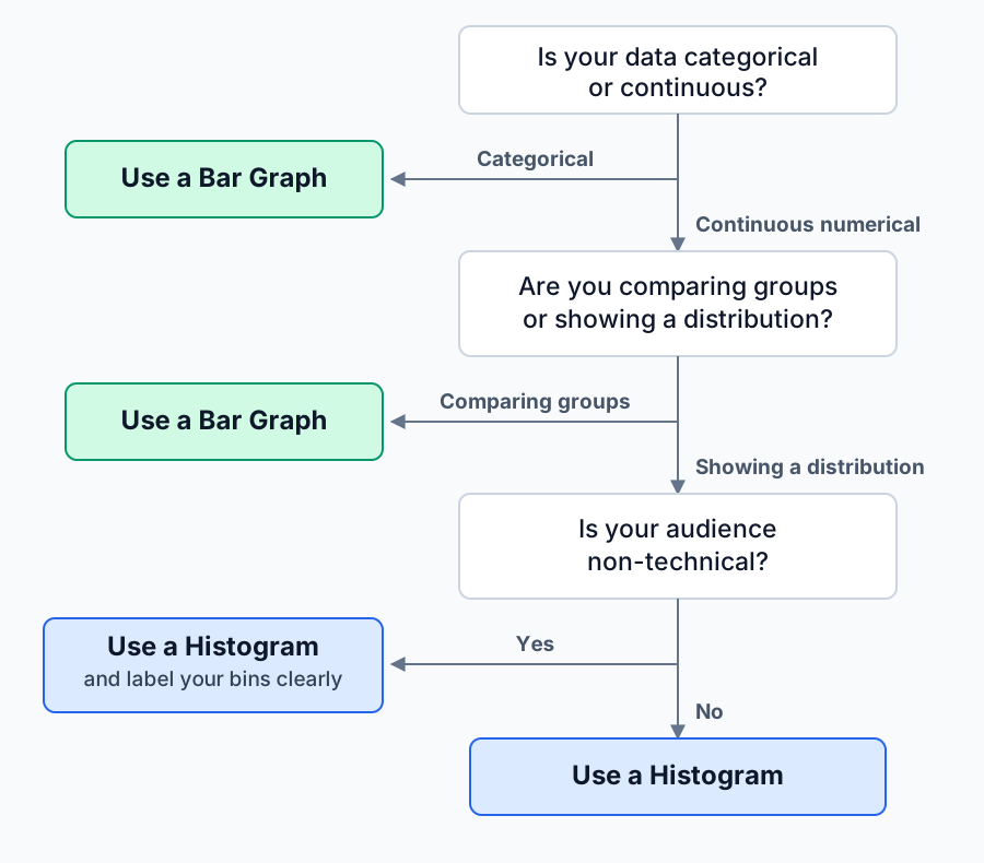
Three questions. One chart choice. Work through these in order every time you are about to build a chart.
Step 1: What type of data do you have?
Is your data categorical or continuous numerical?
- Categorical (product names, regions, customer segments, plan tiers) → Use a bar graph. Stop here.
- Continuous numerical (revenue amounts, deal sizes, load times, customer ages) → Move to Step 2.
Step 2: What question are you answering?
Are you comparing groups, or showing how values are distributed?
- Comparing groups (which region had the highest sales?) → Use a bar graph, even if the data is numerical.
- Showing distribution (how are deal sizes spread across the range?) → Move to Step 3.
Step 3: Who is your audience?
Will they understand unlabeled number ranges on the X-axis?
- Non-technical audience → Use a histogram, but add explicit bin labels. Consider a callout annotation explaining the shape.
- Analytical audience → Use a histogram with standard formatting.
Bar graphs vs histograms — quick selection checklist:
| Use a bar graph when… | Use a histogram when… |
|---|---|
| Comparing monthly churn rates across five pricing tiers | Showing the spread of time-to-close for 300 sales deals |
| Displaying Q3 revenue broken down by product line | Visualising the distribution of customer LTV across your full user base |
| Comparing NPS scores across customer segments (SMB, Enterprise, etc.) | Showing how session lengths are distributed across all users in a cohort |
| Ranking five sales reps by total deals closed last quarter | Mapping the range and concentration of deal sizes from the last quarter |
| Plotting support ticket volume by category (billing, technical, onboarding) | Displaying how long customers take to reach their first key action after signup |
Practical Tools for Creating Bar Graphs and Histograms in Your Business Analytics Dashboard
The right tool depends on where your data lives and who is doing the analysis.
For teams with a data analyst: Tableau and Looker
Tableau and Looker both handle bar graphs and histograms well, with full control over bin sizing, axis scaling, and visual formatting. They are powerful, but they require a dedicated analyst to configure data connections, maintain dashboards, and adjust chart logic when business questions change. For founders who want self-service access, these tools create a bottleneck rather than removing one.
For Excel and Google Sheets users
Excel and Google Sheets are accessible for small, static datasets and are good enough for one-off histogram vs bar diagram decisions when the data fits in a spreadsheet. The limitations appear quickly: they do not connect to live databases, updating charts requires manual data exports, and histogram bin logic in Sheets is limited. At scale or when data lives in Postgres, MySQL, or another production database, spreadsheet tools break down.
For founders who need answers without SQL or setup
When your data lives in a production database and you need a distribution chart without writing SQL, the workflow gap is real. The newer category of natural-language BI tools closes it by connecting directly to Postgres, MySQL, or your warehouse and generating the chart from a typed question — no export step, no analyst ticket. If you evaluate one, check two things: whether it picks the correct chart type on its own, and whether it enforces read-only database access so it can never modify your data.
FAQ
Is the histogram the same as a bar graph?
No. A histogram and a bar graph look similar but represent fundamentally different types of data. A bar graph compares distinct, named categories — such as revenue by product line — while a histogram shows how a continuous numerical variable is distributed across a range. The gap between bars in a bar graph signals that categories are separate; histogram bars touch because the underlying data is continuous.
When not to use a histogram?
Do not use a histogram when your data is categorical rather than continuous, when your sample size is too small to form meaningful bins, when you need to compare two groups side by side, or when your audience needs clear labels to follow the chart quickly. Histograms only work correctly when the X-axis represents a genuine numerical range — if it displays names or labels, a bar graph is the right choice.
Why would someone make a histogram instead of a bar graph?
A histogram reveals the shape of a distribution — where values cluster, how spread out they are, and whether the data is skewed. That information is invisible in a bar graph. When a founder wants to know whether most customers have low LTV with a few high-value outliers, or whether deal sizes cluster at the low end of the range, a histogram surfaces that pattern directly.
What is one way to differentiate a bar graph from a histogram?
Look at the gaps between bars. A bar graph has spaces between its bars because each bar represents a separate, unrelated category. A histogram has no gaps because the data is continuous — every value within the range is possible, and the bars represent adjacent numerical ranges. Gaps in a histogram are a formatting error that incorrectly implies the data is categorical.
Conclusion
You now have everything you need to make the right call. If you are building a chart today, the action is three words: pick your data type, then pick your chart. Categorical labels go to a bar graph. Continuous numerical ranges go to a histogram. Run it through the three-step framework in this article if you are unsure.
If you found yourself nodding at the board-meeting scenario in the introduction, the chart type confusion may be one symptom of a bigger pattern — answering data questions by asking an analyst, waiting on SQL, or exporting stale spreadsheets. That delay compounds across every decision you make. You deserve faster answers from your own data.
If this was useful, you might also want to read: Which chart type should you use for each business metric? or How to read a distribution chart without a statistics degree. Both will make the frameworks in this article easier to apply immediately.
Ask your data a question instead
Connect your database and ask in plain English. GetInsights writes the SQL, runs it read-only, and hands you the chart and dashboard.
Start for free